Lib Dem bar charts
I was beginning to feel a bit bipartisan. Thinking about the common problems all political parties and activists have campaigning in the modern world. I even saw the opposition councillor walking past doing a bit of a leaflet drop and felt a bit of empathy for him. But then my long awaited Lib Dem election leaflet dropped through the door.
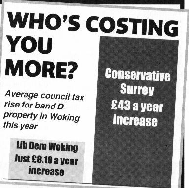
This has to be one of the most brazen Lib Dem bar charts I have ever seen. I choosing my words as carefully as I can here - my wife heard a far stronger version an hour or so ago.
Let me explain - below is one of those infamous Lib Dem bar charts - not the can't win here one (though they have one of those and is as bad as ever ), but one on council tax. I have a band-D property so I know exactly how much money is charge for each service - see below. Those of you who can count will spot that Surrey CC tax was £1009.62, the £43 increase is 4.4% over the last year's figure. For Woking Borough council £190.62 the £8.10 is also 4.4% on the last years figure.
A realistic and fair bar chart would therefore show percentages and be of the same height. ( And that doesn't take into account the fact that the settlement from central government was good this year for the Borough and neighbouring Guildford council managed a 1.95 % council tax rise. In fact Woking's council tax bill is the highest in Surrey ! ).
So what do you think of the bar chart now ?
It was delivered at the last moment - before anyone can start to let people know about the real nature of what they have said.
The leaflet goes on to complain about Surrey CC (Conservative controlled) - even though there is no election this year for the country council !
I add the relevant section of their leaflet below.
Just in case your wondering - here is the Conservative bar chart I received, and have on one or two occasions delivered:
I have a small criticism of this also, like many newspaper graphs it isn't grounded at zero. Whilst the gaps between the different levels look ok - all the bars themselves should be higher by around 15% ( this would make the gaps look less, but not by much really - which is why this annoying). ( Based on my rough estimation with a tape measure - its getting late you know. Its possible the charts are based on area, but I think the tendency is to read them as height. It too late at night to work though all this now.)
None of the charts shown is strictly untrue - but they all lead to perceptual difficulties, especially when just glanced over. In my opinion the Lib Dem one is by far worse, and very likely to lead the viewer to conclusions that are false.
We can all do better - but I suspect the Lib Dems have by far the furthest to travel. ( See - I'm still trying to be charitable).


1 comment:
We had the same last minute delivery by the Lib Dems in my part of Guildford, but the Conservatives managed one, too. The Lib Dem leaflets were outrageous - almost entirely misleading. I have to say that overall the Conservative efforts here were really impressive, a lot of hard work, positive leaflets and no denigrating the opposition. In all justice the Lib Dems deserve to be badly mauled here, but the Surrey Advertiser has all but called for them, and some Conservative candidates are the subject of a continuous smear campaign, so the Lib Dems might yet escape their just desserts.
Post a Comment